
Heineken Brewery (Heineken Brouwerijen) is a Dutch brewing company, founded in 1864 by Gerard Adriaan Heineken in Amsterdam. Heineken owns and manages one of the world's leading portfolios of beer brands. The principal international brands are Heineken and Amstel. Heineken is positioned as a premium brand, except for their home market in the Netherlands. Heineken is the leading beer brand in Europe and Amstel is the third largest. In Europe, Amstel is positioned in the mid-priced mainstream segment, the largest segment of the market, and is available in more than 90 countries around the world.
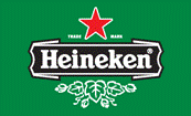
Heineken claims that it really has two brand logos - the Authenticity logo and the Star-Heineken logo.
Authenticity logo has been specially developed to communicate and reinforce the brand’s brewing quality, heritage and authenticity. Its primary application area is direct beer related items.
Star-Heineken logo has been specially developed to communicate and reinforce the modernity and vitality of the brand. It may be applied in communication, sponsorships, merchandise and packaging. Star-Heineken on a Heineken green background is preferred above on a white background, it reflects the character of the brand better.
The green bottle with racetrack label is the origin of the brand’s visual identity.
According to Wikipedia, the three 'e's on the Heineken logo are tilted backwards slightly, making them look like they are smiling. The smiling Es were brought in as the original label was thought too formal for the beer.
As of 2006, Heineken owns over 130 breweries in more than 65 countries and employs approximately 64,000 people. It brews and sells more than 170 international premium, regional, local and specialty beers, including Cruzcampo, Tiger, Zywiec, Starobrno, Zagorka, Birra Moretti, Ochota, Murphy’s, Star and of course Heineken.
Source
http://www.dinesh.com ('http://www.dinesh.com/history_of_logos/beer_logos/heineken_logo_-_design_and_history.html')


